
Sample screens from the KEDS_Display program
KEDS_Display is designed to illustrate how a set of aggregrated event data looks in the Middle East; it is also a test-bed for experimenting with some alternative methods of displaying event data. These screen captures show the displays that can be generated from the program. The captions beneath the displays describe some of the program interface; the commands described only work in the program, not with the display.
Map Display
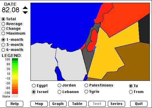
The map display shows a map of the region; the Goldstein-scaled intensity of the interactions with other actors is indicated by color. The time period being displayed is adjusted using the controls in the upper-left corner; the interactions being displayed are chosen using the radio buttons below the map.
Series Display
![[Time series display]](KDisp.series.JPG)
The series display shows a time series plot of the Goldstein-scaled interactions for a selected dyad. The vertical line shows a specific time period or group of time periods; this can be used to select a time period of interest before switching to an alternative display. The options listed to the left of the display can be used to apply an assortment of transformations to the series.
Table Display
![[Table display]](KDisp.table.JPG)
The table display simple shows the numerical values of the Goldstein-scaled interactions for a selected dyad and time.
Graph Display
![[Graph display]](KDisp.graph.JPG)
The graph display shows all of the dyadic interactions of a selected actor at a specific time period. The width of the line is proportional to the number of interactions and the color is determined by the Goldstein-scaled intensity. By holding down the mouse on one of the date buttons, this display can be animated.